You might've seen numbers like '::2' inside Midjourney prompts. These are called prompt weights and they help you emphasize (or de-emphasize) certain parts of prompts.
Some weighing basics:
- All words have a default weight of 1 (but words at the start of a prompt have a greater effect on the result than words at the end)
- Commas are soft breaks, '
::' are hard breaks
So a comma between phrases of words says "these are different concepts" and a '::' divider says "these are very different concepts". - Prompt Weights:
::by itself is just a hard break. If you add a number after it, such as::2or::10, emphasis will be added to the section preceding the:: - You can also add a negative weights such as
::-1(for what you don't want) - The
--nocommand is a shortcut for assigning the weight::-0.5, which is a pretty good amount for specifying what you don't want. - IMAGE WEIGHTS: You can weigh image prompts as well, with
--iw.
Seems like a lot to remember, but it's actually pretty intuitive. Let's go through some examples:
| Prompt | Image | Comments |
wood::teapot | 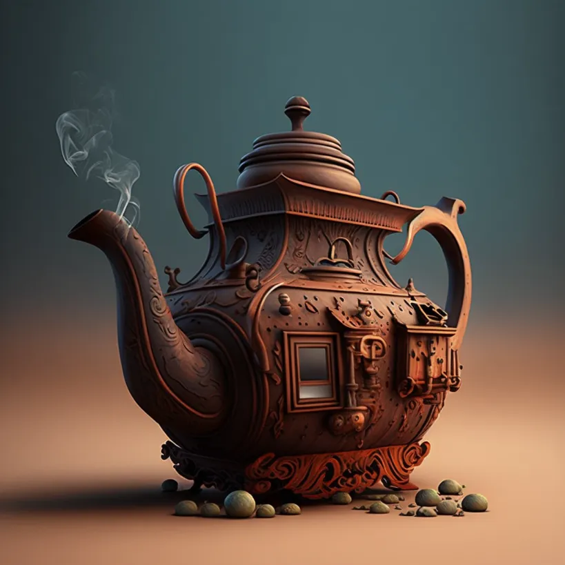 | If you don't specify a weight after the :: it defaults to 1 |
wood::2 teapot::1 |  | Pretty big change |
wood::3 teapot::1 | 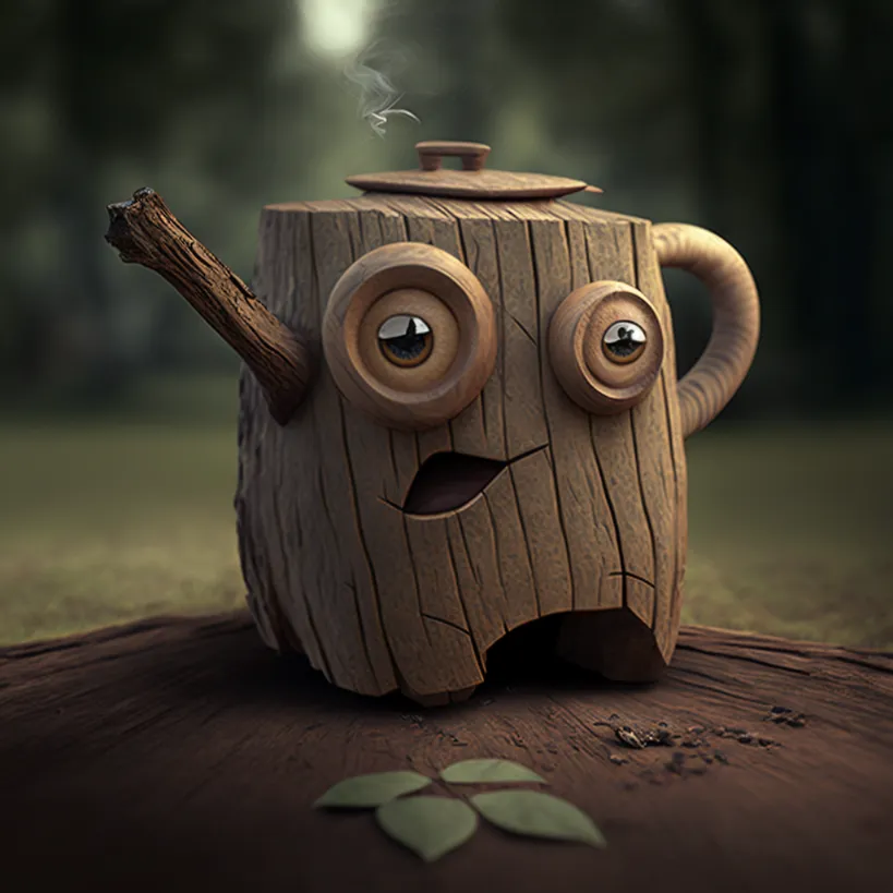 | More wood than teapot |
wood::4 teapot::1 | 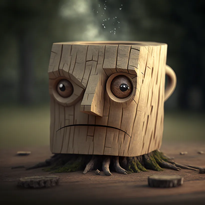 | I guess that's a handle?? |
wood::5 teapot::1 |  | Yep that's wood |
Note: I'm setting the seed value to be the same in all these examples. Controlling the seed lets you keep images consistent across generations, so we can see the effect of changing the image weights only.
Let's go the other direction now:
| Prompt | Image | Comments |
wood::teapot | | Same starting point |
wood::1 teapot::2 | 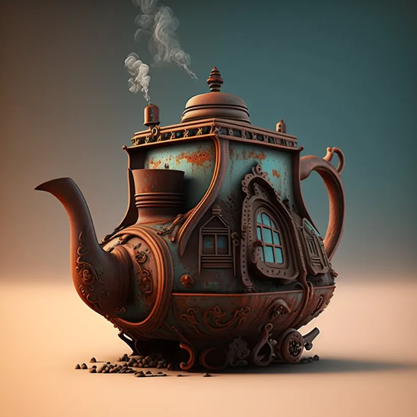 | Slowly getting rid of wood |
wood::1 teapot::3 | 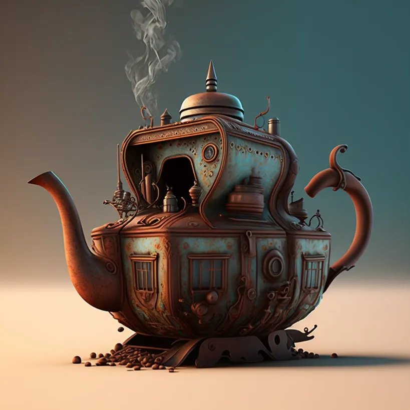 | Slowly getting rid of wood |
wood::1 teapot::4 | 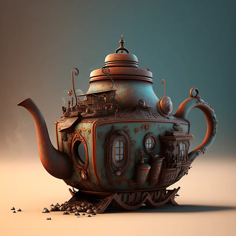 | More of the same |
wood::1 teapot::5 | 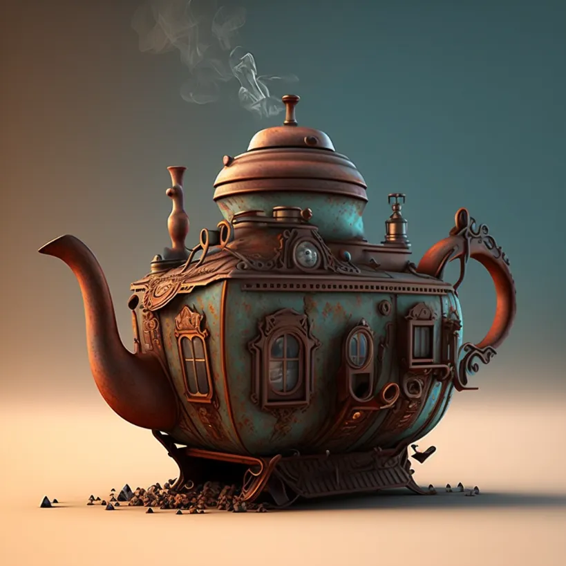 | More of the same |
There's no need to set a super high weight value; I've noticed that once you go past a ratio like 1:5, the underemphasized element completely stops mattering.
Keep in mind:
Relative weights matter, not absolute
Weights matter in proportion to each other.
So wood::4 teapot::1 will yield the same result as wood::8 teapot::2, which yields the same result at wood::16 teapot::4, and so on.
Negative weights
Let's see what happens when we use negative weights to describe what you don't want:
| Prompt | Image | Comments |
studio ghibli anime, stormtrooper | 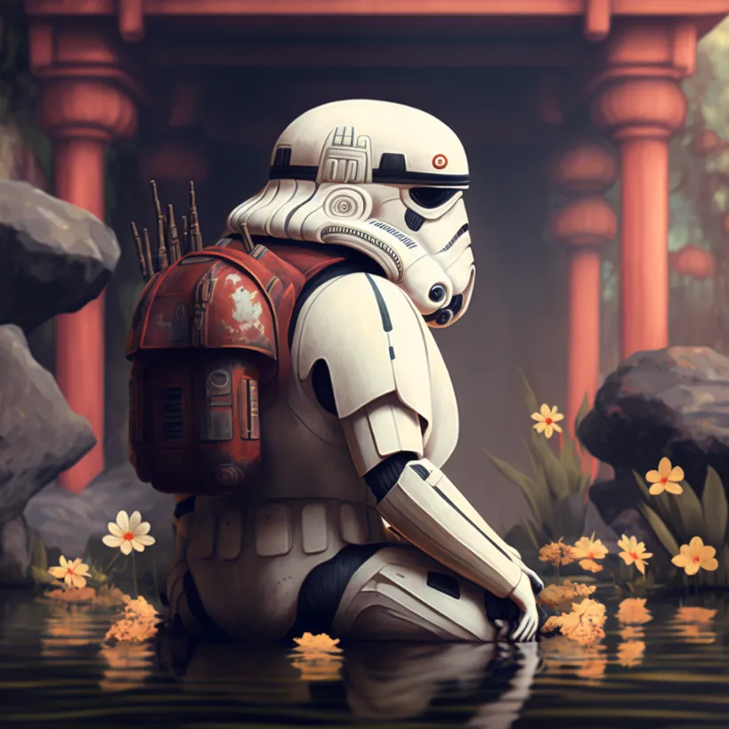 | No negative weights added yet |
studio ghibli anime, stormtrooper::1 3d render realistic::-0.1 | 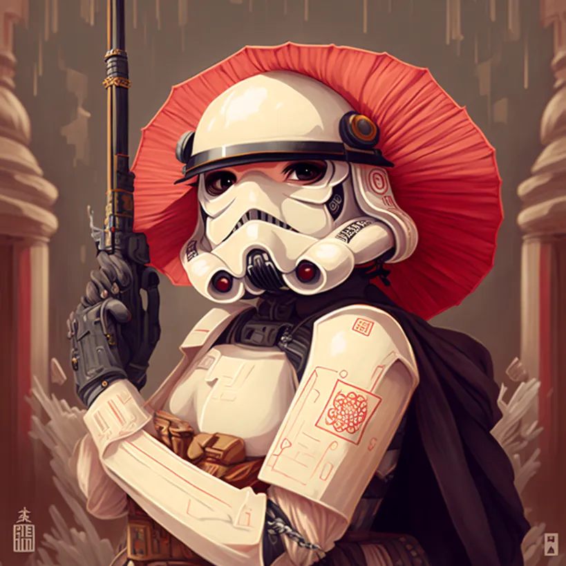 | Add the following negative weight to "3d render realistic" because I don't want the realistic style here |
studio ghibli anime, stormtrooper::1 3d render realistic::-0.2 | 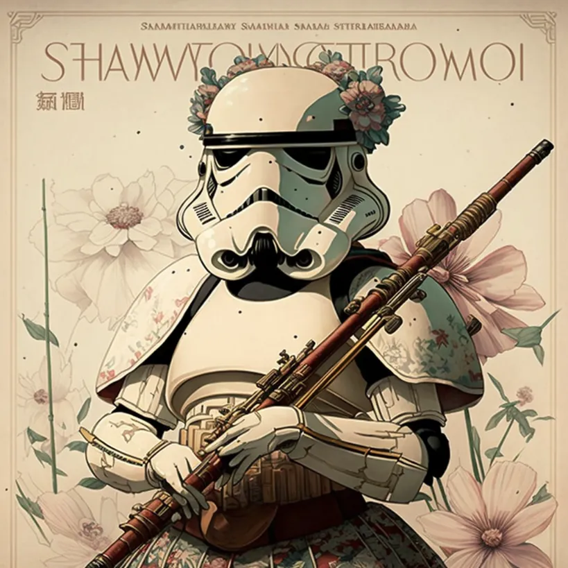 | A little negative prompt goes a long way |
studio ghibli anime, stormtrooper::1 3d render realistic::-0.3 | 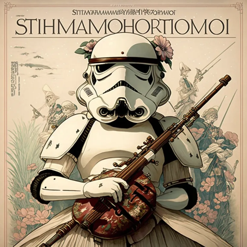 | More of the same |
studio ghibli anime, stormtrooper::1 3d render realistic::-0.5 | 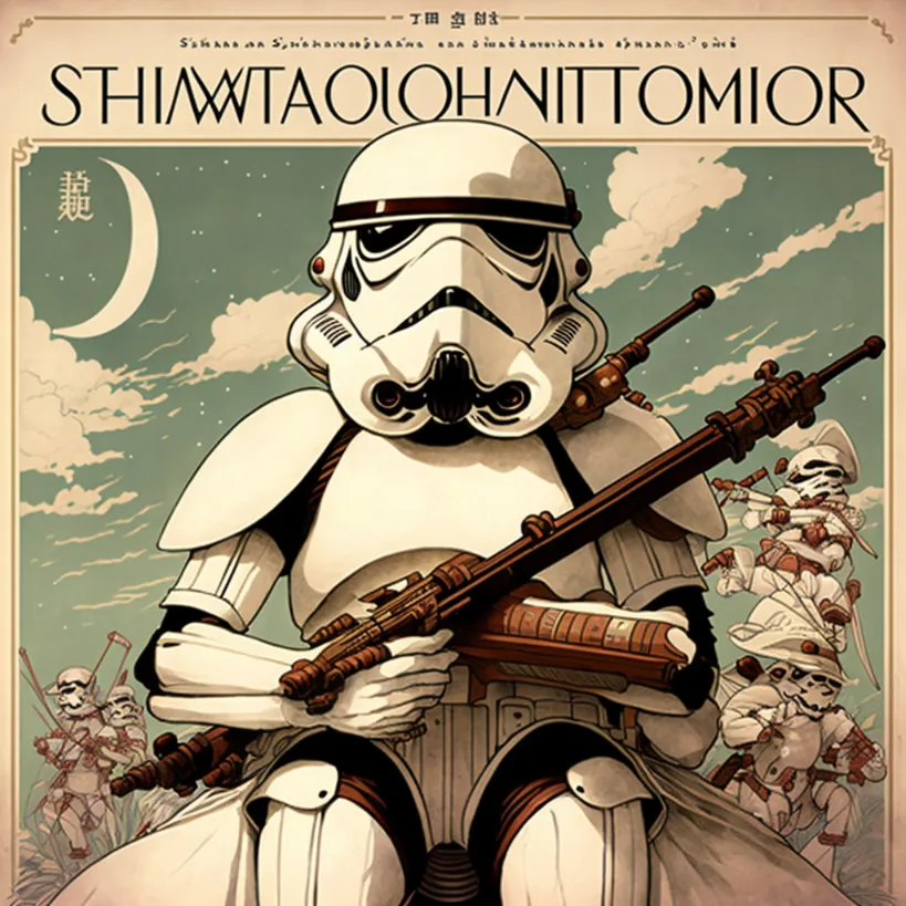 | More of the same |
studio ghibli anime, stormtrooper::1 3d render realistic::-1 | 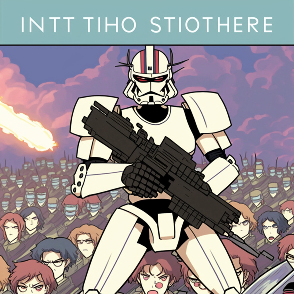 | The negative prompt is just as strong as the positive prompt creating unpredictable results. |
Keeping in mind negative prompts are also relative, so wood::1 teapot::-1 is the same as wood::10 teapot::-10.
Side note: If you are trying to generate anime styles you should 100% be using Midjourney's Niji model.
'--no' command
The --no command is a shorthand for "::-0.5" which is just a regular negative weight.
You write the things you don't want after the --no. Such as --no 3d realistic realism.
You can use it if you prefer not to think about numeric weights.
-0.5 is a pretty good benchmark: it zaps out things you don't want without making the negative prompt too strong.

Thank you for this. The image examples were especially handy.
Hey Holly,
Glad it was helpful!